A New Epoch of Aesthetics – La Gloria – Shop Interior
The global leather brand La Gloria is head up with its first store at the radical area of Banani. Revamped by MSH Atelier, the design team tried to develop a non-conventional portable design approach.
The 140 square-meter store resides in an old building that held obsolete electrical and plumbing ducts. From the design team, reforming these timeworn mechanical affairs was the major challenge the design team had to set out. In addition to this, the store has a limitation with a single congested entry which pushed the design team to rethink on the entry-point. The access point is therefore thoughtfully projected by an external staircase permitting a more clean and defined approach. An internal staircase has been as well, appointed to get down. The design of this interior is inspired by the concept of living ‘minimal’ and ‘portable’. “At this modernized era, people tend to be more transmuting.
They generally look to invest on furnishing that is multi-functional and has light minimal design”, says the design team. “Coping with this minimal and transmuting style of living lead to a muted and silent interior for this store.”
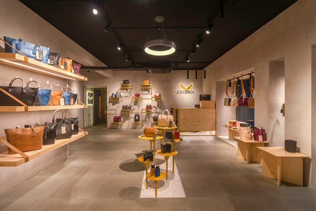
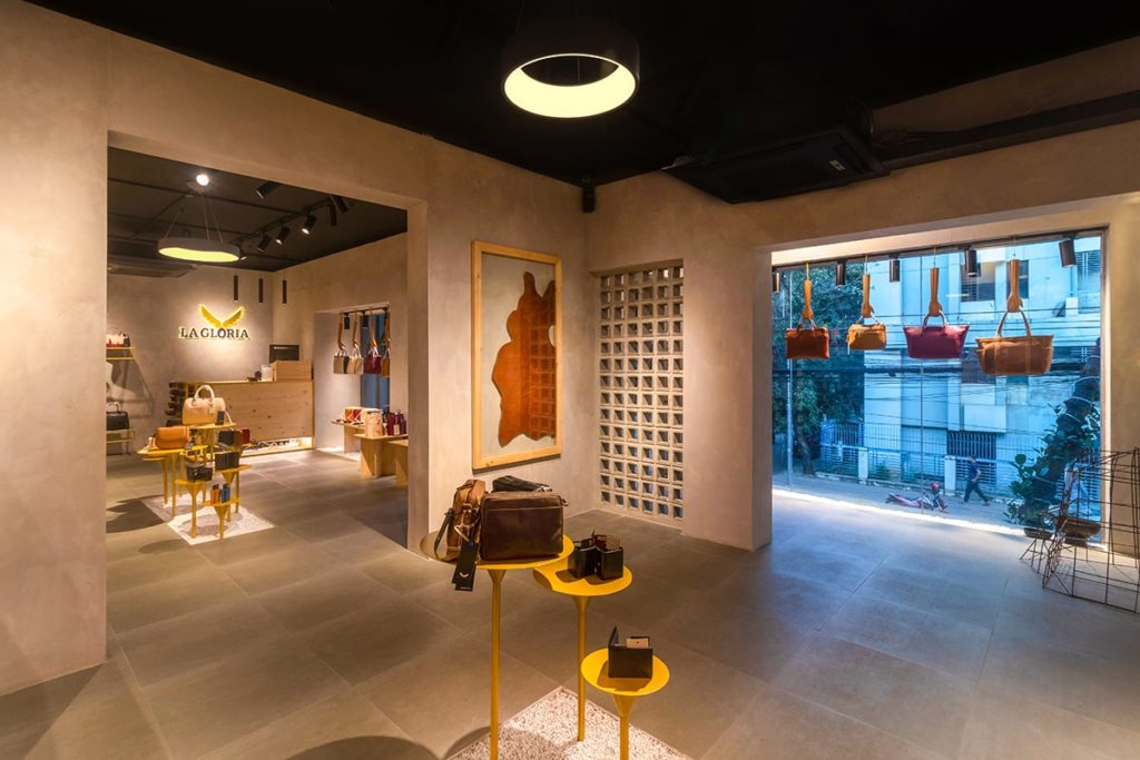
The free-flowing plan with cement textured wall becomes the background for the products. “I have always had a preference for simplicity, so it only felt natural to give this store a muted texture that perfectly manifests clean and calm atmosphere,” adds the team. La Gloria is well known for their uncompromising dedication towards producing fine grade leather products. The owners of this company have always been pulled by diverse design ideas. From the beginning of their business, they exported products in several countries. After successfully operating several stores worldwide, La Gloria decided to launch its flagship store in Bangladesh. “Leather is a very delicate material to grip on, after getting the approval for the design, it was a great responsibility to uphold the grade of the pioneering brand,” the team continues.
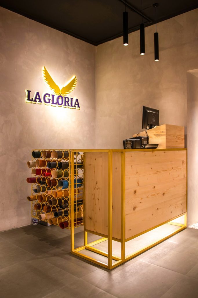
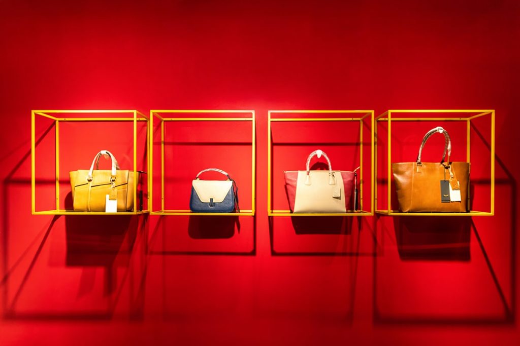
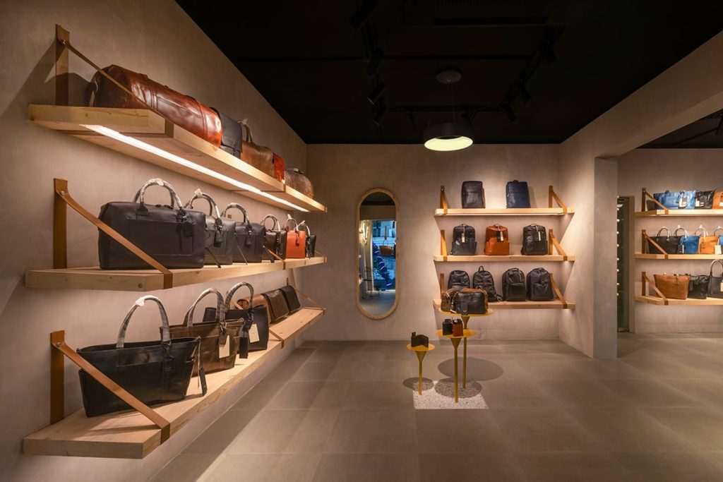
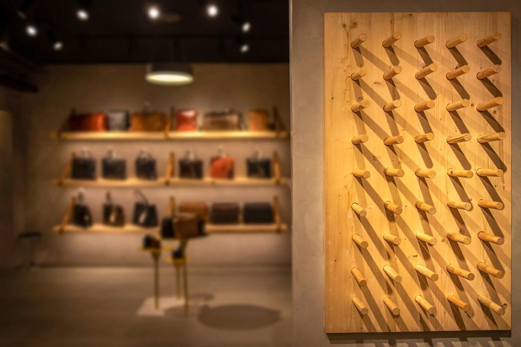
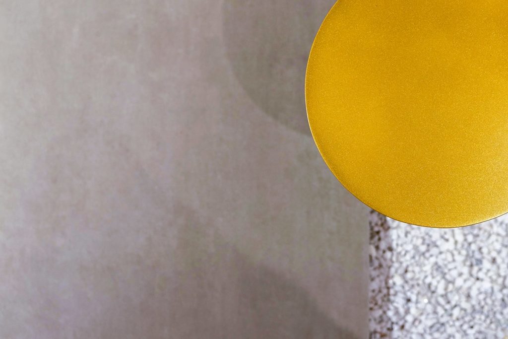
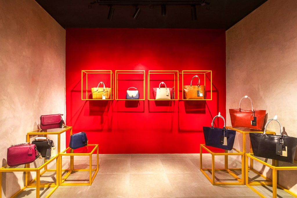
A large store and space for business meeting and staff resting areas have been included in the layout. The store space aborted partition walls making the space look larger spatially. To go along with the aesthetics of the high-end leather goods, wooden and steel ascent finishes off the material palette. Warm wooden shelves provide a platform for showcasing exclusive bags, wallets, belts and other accessories. Exposed electrical duct and HAVC units are merged with the black ceiling that provides a less distracting enclosure for the interior. Central spaces are dedicated to the newly arrived products on a portable stool enhanced with a golden touch. Pegboard and gold painted steel frames are used to display the products in a different harmony.

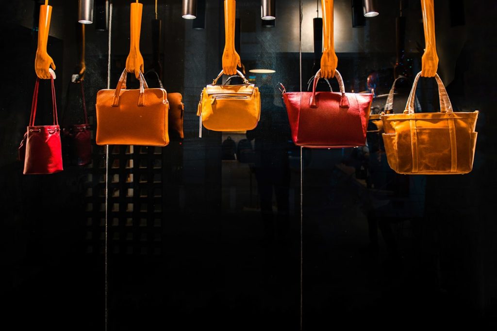
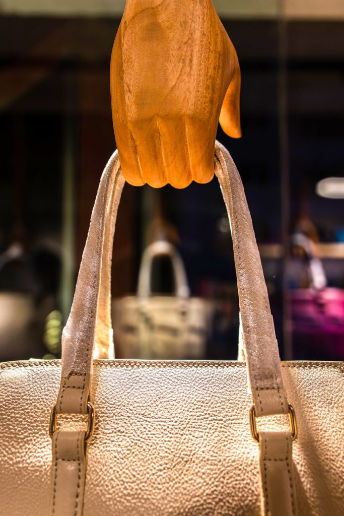
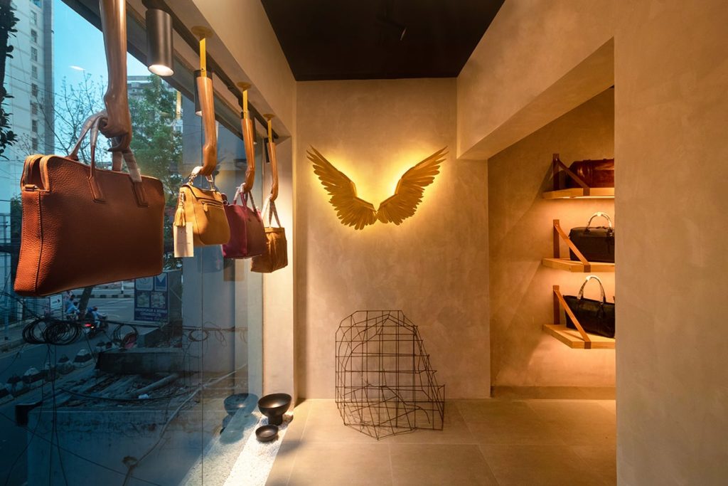
In the daytime, an ample amount of natural light reaches to every corner of the store through the large windows. Some sculptured symbolic hands displaying bags hang over the windows which are sculpted from pine wood; adds a fun element to the store. A dash of bold red central wall accentuating one corner – is agreeably the highlighted space of the store.
The light setting installed is not over-powering and accentuates the outside dusky setting; enthusing the passerby at night. Overall, the design reflects contemporary aesthetics and a timelessness reach.

