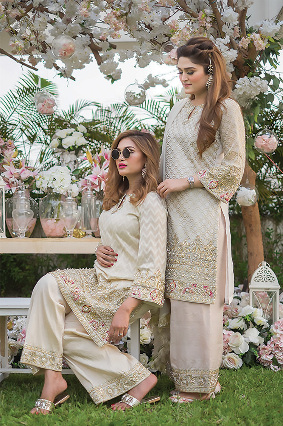
Dominant for its soft soothing pastel pallets and unique range of Asian and fusion wear with luxury prêt, heavy formals and bridal couture being their forte; the fashion store Sahar Rahman Couture locates at the corner-block of Dhaka city’s affluent Gulshan neighbourhood. The store has been implemented with a homely, muted-tone interior in collaboration with the Increation interior design studio.
The store is set on an older building that has a great architectural charm on the outside. The designer of the outlet and managing director of Increation, Architect Shafqat Rahman expressed that when it was time to renovate, the home presented costly challenges that were not so charming. “Older homes have a distinctive character, but things were made differently back then.
The homes were constructed to different building standards and codes than today”, explains the architect. To incorporate modern interventions, the design team began striping back the floor to an empty shell. They excluded a handful of partition walls and had to remodel the whole electrical panel and plumbing ducts.
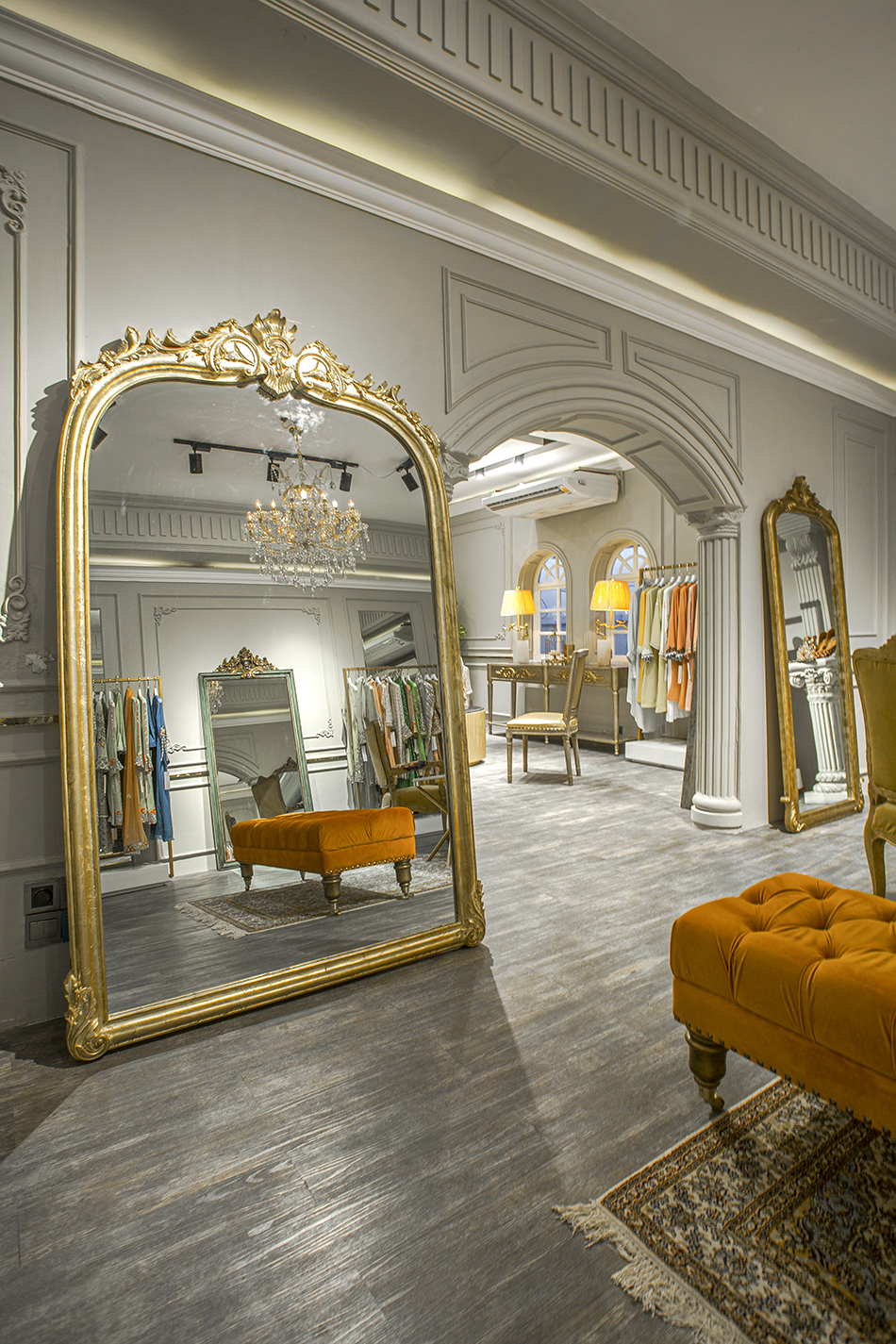
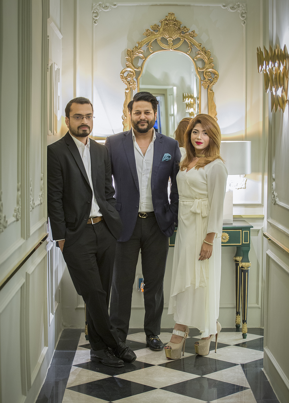
The fashion store was a challenge for the design team due to not only the renovation but also to encounter the deadline. With 5000 square-feet wide space, the store stands out for the care with the details and was developed between the presentation of the first idea and the delivery in just forty days. Powerful sister duo Sahar Raman and Amana Rahman, the owners of the store, knew exactly what their interior design needed to look like.
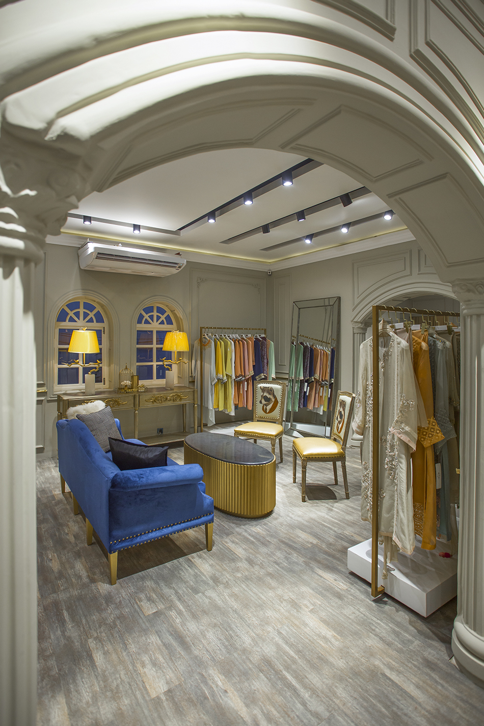
They were very clear about their design concept, colour palette, and were mindful about every detailing that assisted the design team to meet the crucial time frame. “Fortunately we could meet the deadline as we have all in-house designers and technicians and all the furniture and décor accents were customized according to the clients’ preferences from our sister concern group which is Casa Déco. Things get a lot easier if clients know specifically what they want and what they want to skip.
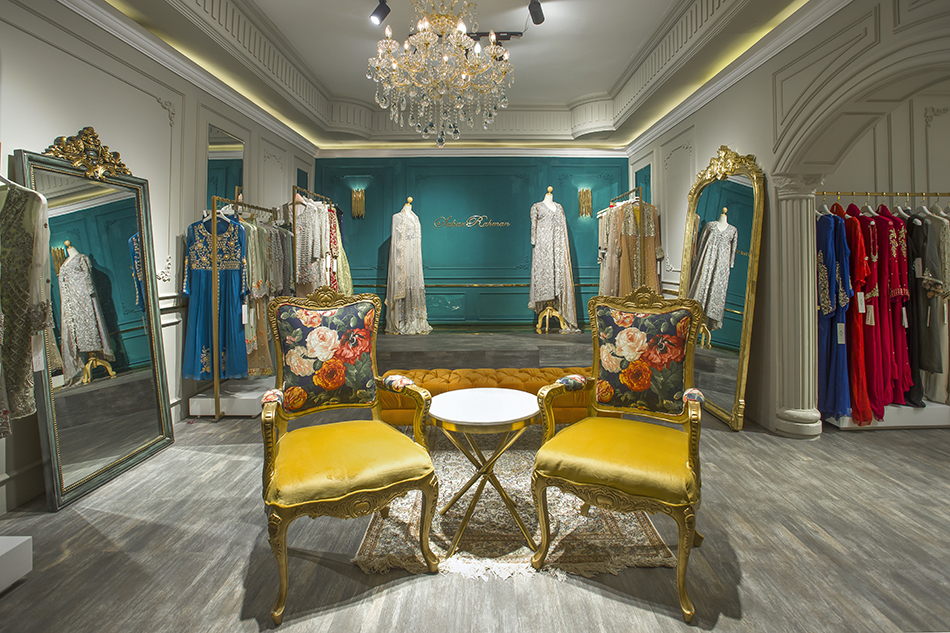
The fashion store is indeed a co-creation of the clients and the design team”, adds architect Shafqat. The concept of the interior design is based on a thin line between classic and contemporary, a mix of new and old. While adding a little Parisian flair to the store, the store unwinds a stunning balance between sophistication and chic romanticism.
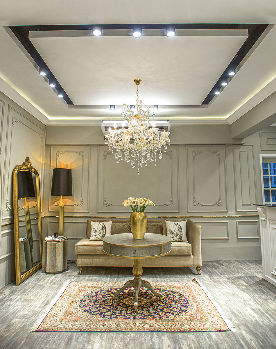
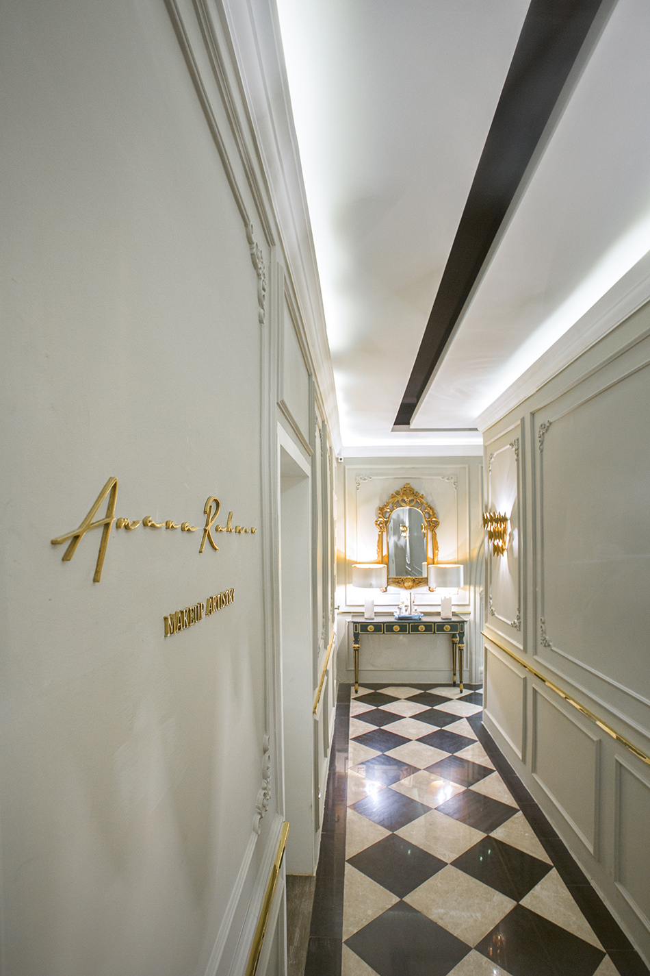
The peripheral walls have been painted in subdued mushroom, while a few of chunky partitions are jade blue. The whole interior is a neutral space with strong architectural expressions that pay homage to the designers’ structured and intricate tailoring. “The sister duo is well travelled and have a mindful-eye on details and design. The store has been their ultimate dream and mission and they wanted to create something the city has never seen before. So it was a solid challenge to pull off to their ambition; but knowing the sisters for years and working closely with them, there is a trust-factor between us that encouraged us to go beyond the edge”, says the architect team, architect Sayeeda Fahmida Zeba and architect Fahim Hossain.
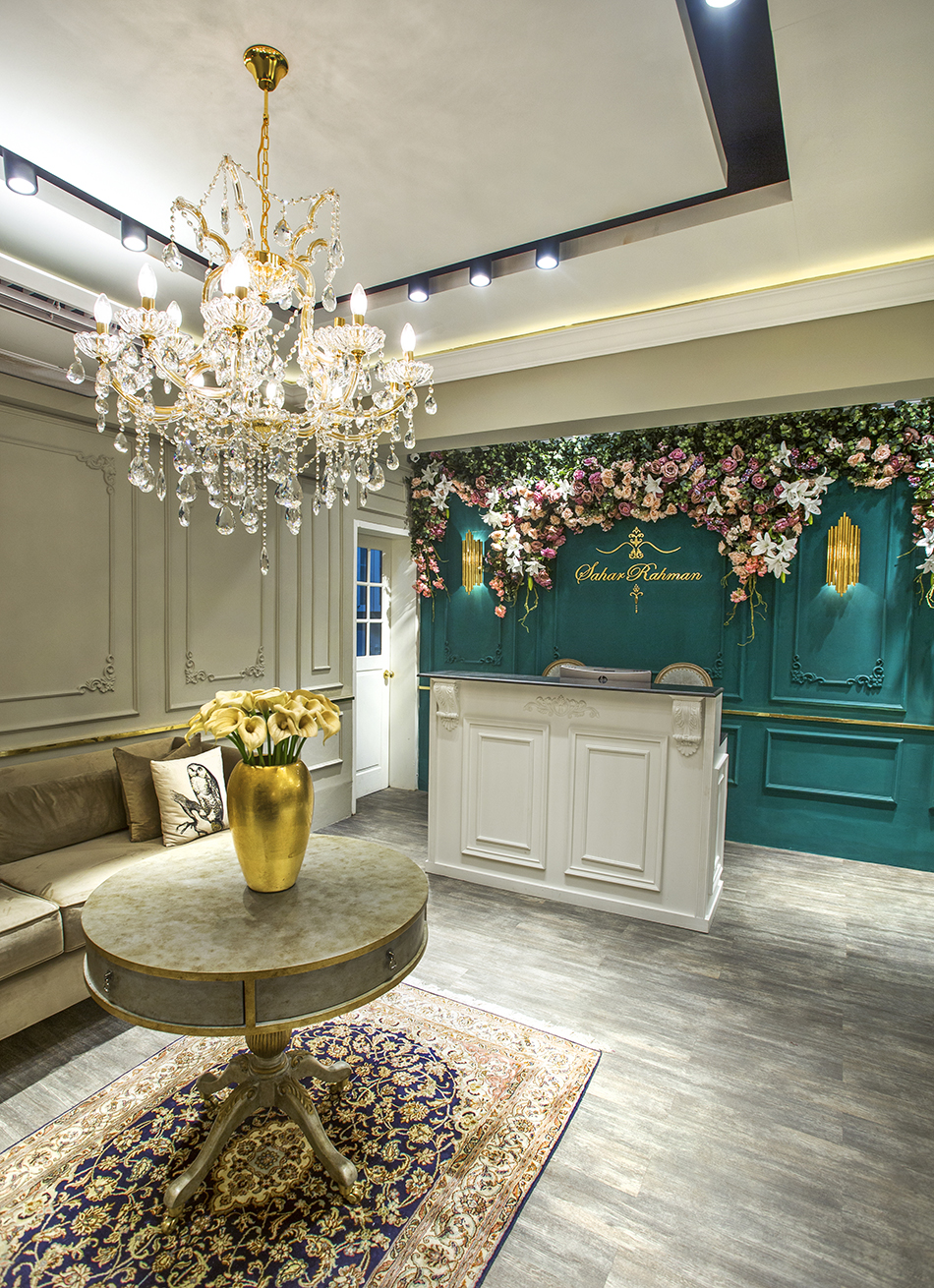
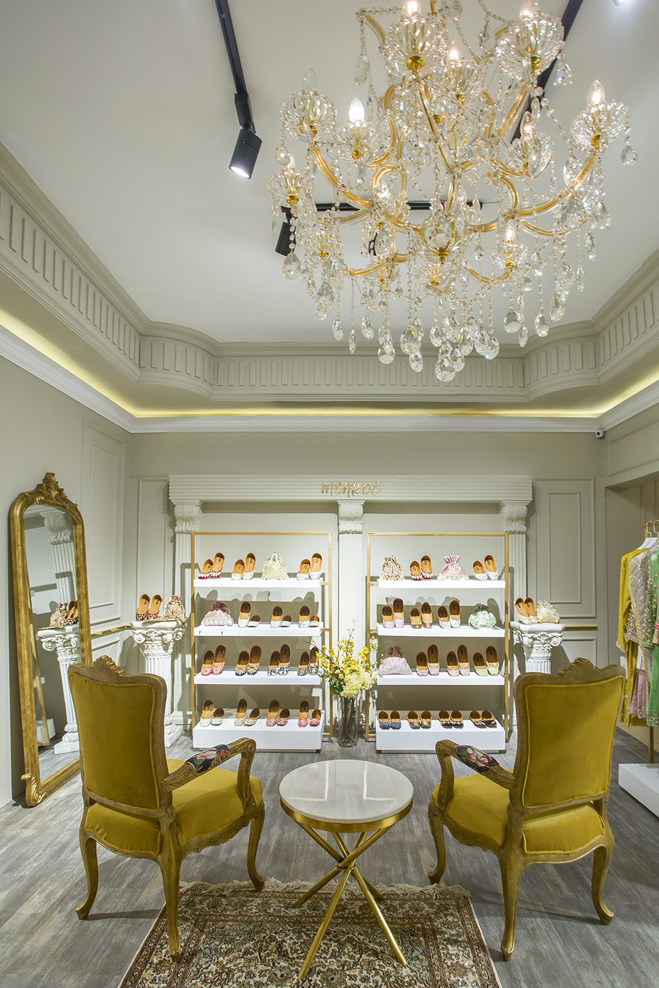
The pair of armchair draped in classic French linen sitting in the foyer, next to an accent floor lamp, creates a dramatic appearance at the entrance of the fashion alcove. Moving to the rear, the monochrome palette with intricate period details adorns the walls and matching crystal chandeliers lead to the next rooms. The shimmering bling of the ornate light fixture adds an immediate drama and style to the place.
The centre space is envisioned as a more formal square that includes a greeting bar, complemented by a backdrop pendant with a mix of flowers that creates a space that is both inclusive and inviting. Other spaces are adorned with chunks of antiques and modernist pieces that juxtapose beautifully with age and history. The designers brought edgy, streamlined furniture and vintage accent sofas with velvet tufted upholstery, and some more modest pieces of armchair and console which have elements of Rococo style; all that brings more sumptuous, luxurious and formal feel.
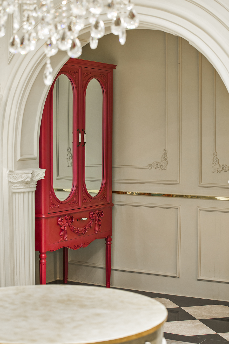
The statement décor that steals the show of the Parisian chic is the typical French armoire residing in one of the corners. The versatile piece that has the romance and vintage appeal creates something old with an air of sophistication.
The store has been decadently designed to create the perfect framework to highlight the elegant, classic and feminine silhouettes the designers are renowned for. Garments are hung from spindly gold-metallic rails, complemented by large mirrors that are edged in gold-hued metal. The only metal chose in the store to décor is gold. The Midas touch in every setup of the store enhances the look and ethos of the space.
The overall aesthetic preserves a classic charm with a hint of modern edge. In other words, the designer duos ultimate fashion retreat is refined and timeless.


