The New Face of Tarka
The newly relocated Tarka completely reimagines what was a casual eatery lacking the space required for its extensive customer base and created a refined and stylish restaurant, enhancing the overall experience for the diners. Spread over an expanse of 4000 sq ft, the freshly fitted venue embodies a timeless appeal.
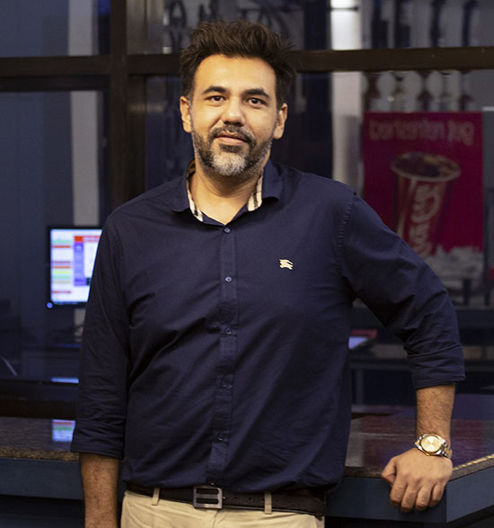
The feature that primarily drew the owners towards the new location was its open-plan layout, possessing the wealth of the stunning city view. “While looking for a new location, our main intent centred on the customer experience. Since this place offered a fantastic panoramic view, we decided to settle on it”, says Ashfaq Rahman Asif, the Managing Director of Tarka. He further shares how the old restaurant had existing areas for development which can now be looked into. “As Tarka was our first venture in the food business, we learned immensely about the things we could improve. The former place was quite packed with a very straightforward menu.
For 6 years, we solely relied on the quality of our food without any promotional offers. There was a growing need for a bigger space as we also had to cater to corporate clients. Hence, relocation was inevitable. Starting from introducing newer items in the menu to serving larger crowds, we now have a vast area to explore”, he adds. The other two partners of Tarka are Nazmul Sakib and Nasima Haq. All the owners of Tarka ensure the food quality and pricing remain the same as before but the environment is much more polished and inviting.
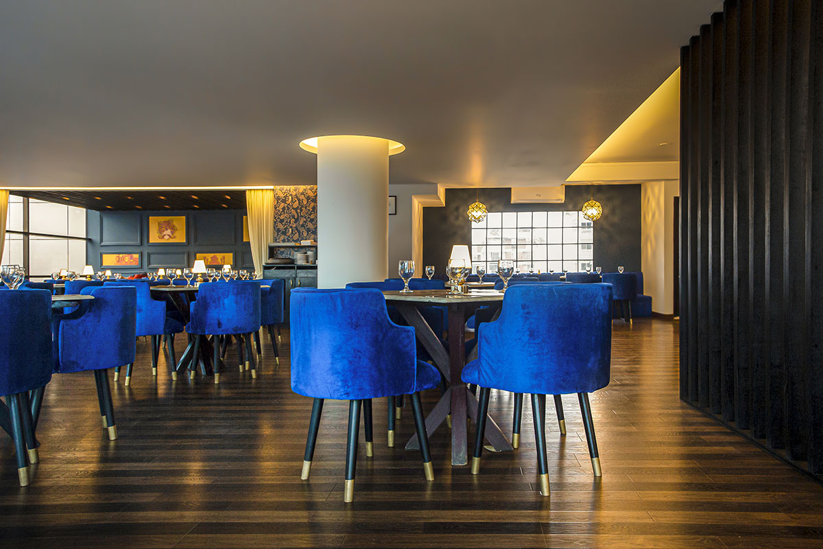
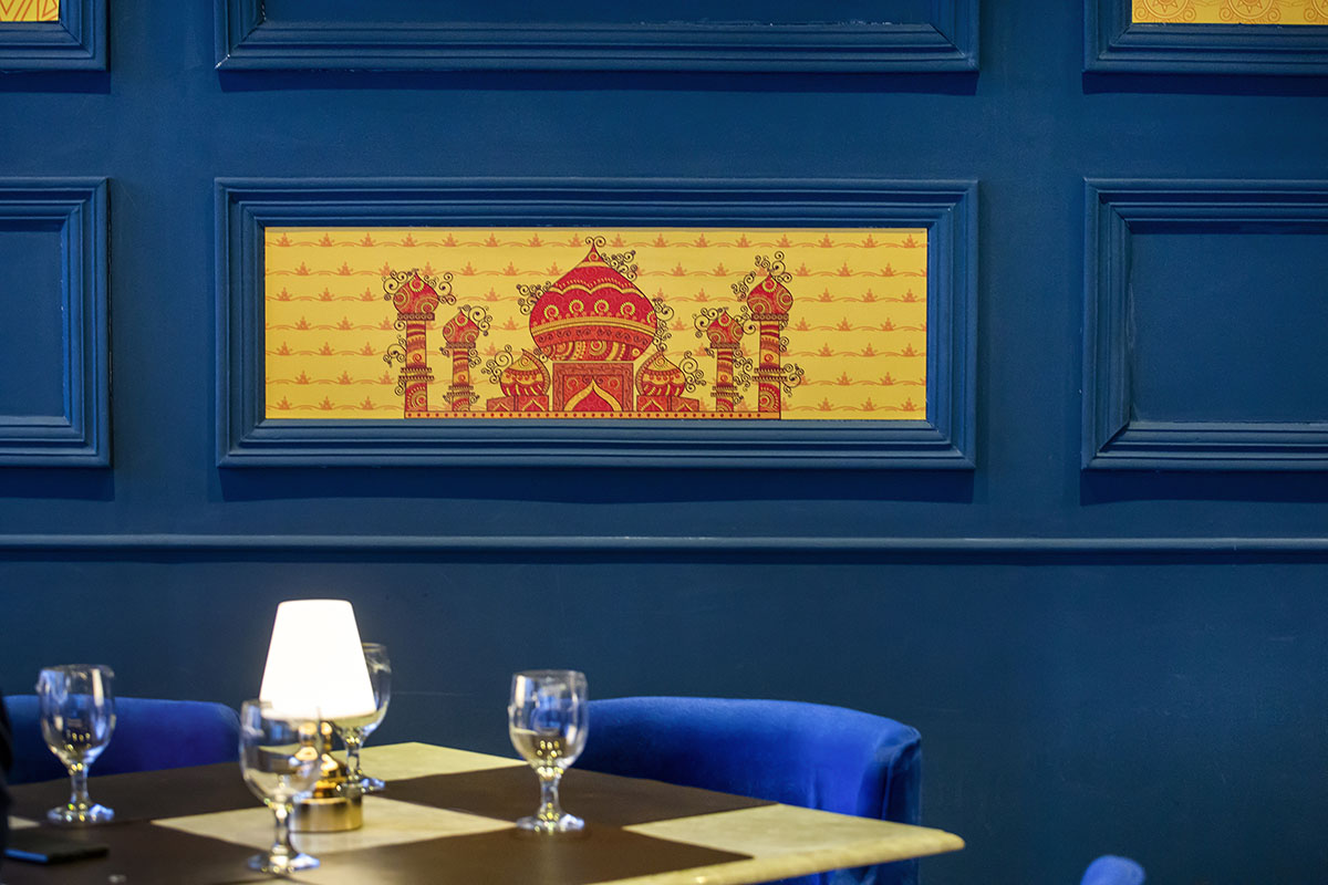
The design concept emphasizes keeping a naturally well-lit and spacious look without screaming Indian. Instead, subtle hints of the Indian theme were fused through the wall decor, colour scheme and cutleries.
For designing the space, the obvious choice for the owners were Ar. Raisa Chowdhury and Aminur Rahman from White Design Solutions, who have previously designed other outlets for them. The design was executed in a contemporary style, preserving the Indian essence through pops of bright colours. The design project started in the second week of December and was completed within two months because of a relatively tight schedule. “When designing a space, settling on a theme first makes things easier. Next comes developing a unique concept and making cost-effective decisions.
Upon asking the owners, their requirement was quite clear- giving the diners an ambience of a ‘fine dining’ restaurant. Hence, visualizing the design was made simple; a formal restaurant, nothing like a cafe or a casual around the corner diner. Tarka was already an established brand so the aim was to create an ambience that gave the customers an experience better than before”, explains Raisa Chowdhury. The genre of Tarka may have gone through a complete transformation, but instead of fitting in with a fad, the design feels as though it has always been this way. “You could be a youngster or a more mature person but still feel like you are in the right place”, says Ashfaq Rahman Asif.
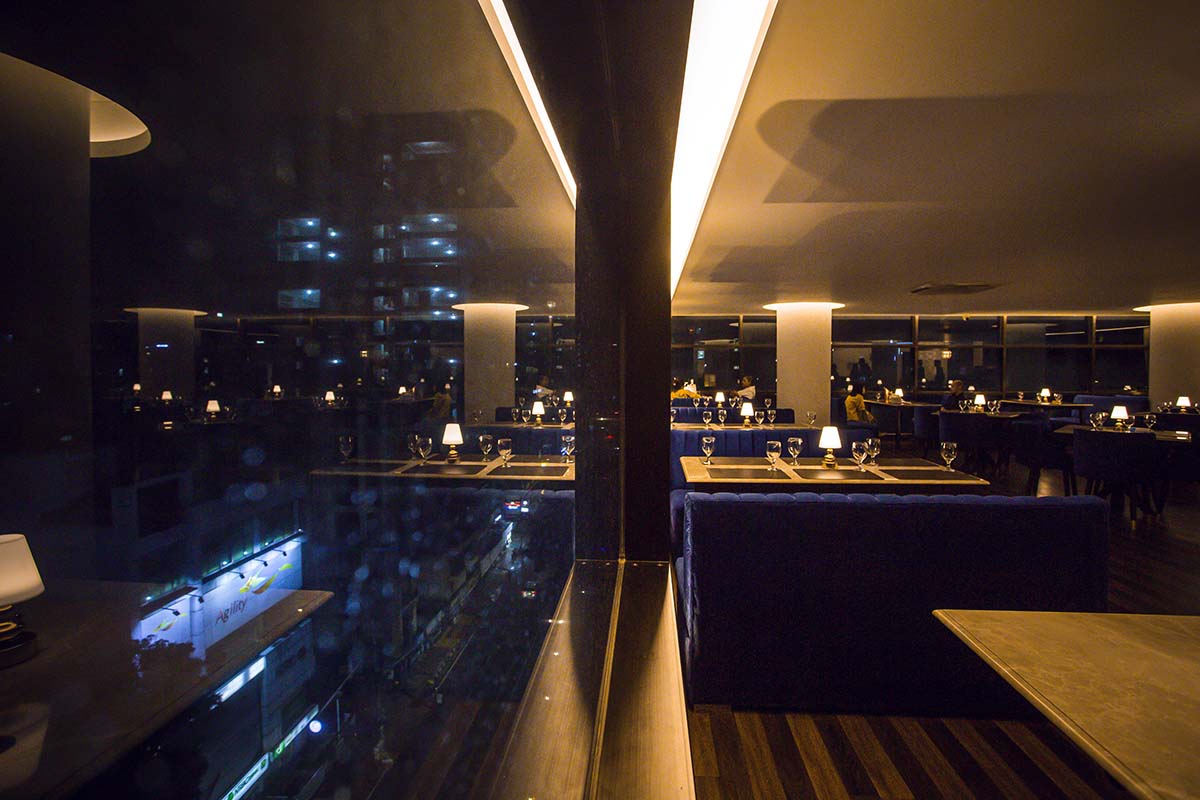
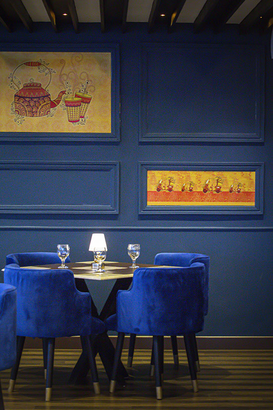
The design concept emphasizes keeping a naturally well-lit and spacious look without screaming Indian. Instead, subtle hints of the Indian theme were fused through the wall decor, colour scheme and cutleries. “With ample natural light coming in during the day, we decided to go for a bright shade as the primary colour. There weren’t too many walls to highlight either so we wanted to introduce bright upholstery. Although our first pick was green, the particular shade we wanted was not available in the local market and importing fabric would’ve been time-consuming. Hence, we settled for the existing royal blue. The decision worked in our favour as the colour helped to tie the place together”, exclaims Raisa Chowdhury. To give the restaurant a formal appearance, gold accents were added while the upholstered furniture remained in solid fabric colour.
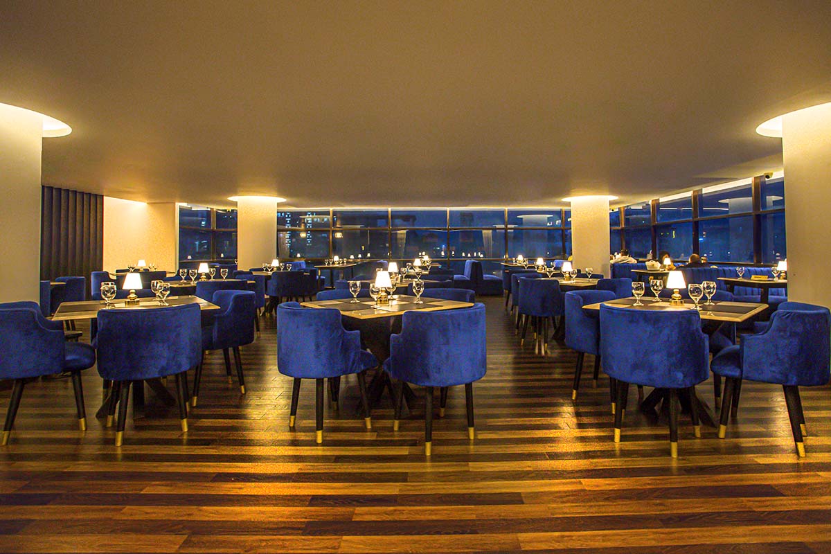
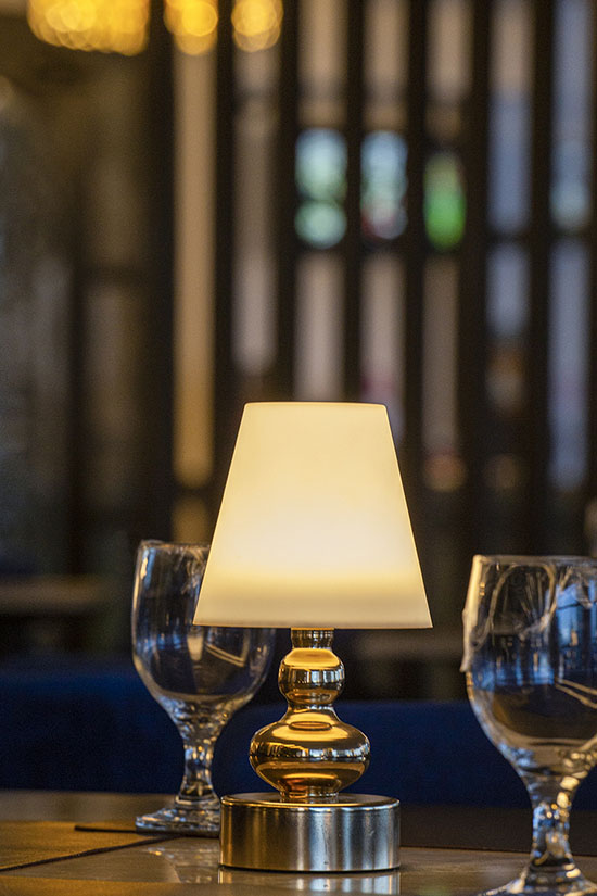
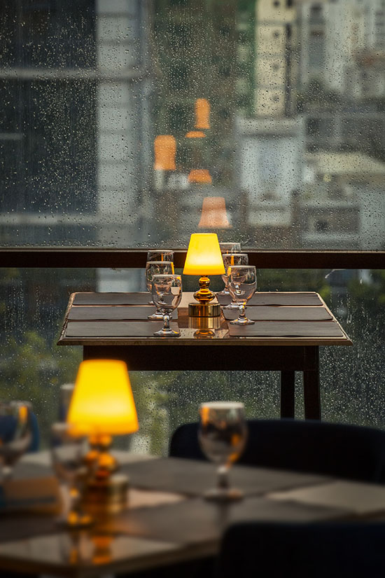
The materials for the place were kept fairly simple with teak boards for all the polished surfaces and furniture, particle boards for decorative wall claddings, and painted shelves. All the furnishings were custom-made from scratch. Lighting was of key importance for the project. The only items that were imported right after confirming the colour scheme were the individual mini lamps on each table. When lit in the evenings, the lamps take the entire ambience to the next level by giving it a cosy yet formal look. The rest of the lighting was kept subtle with individual zones being illuminated using few pendants. One statement chandelier adorns the entry area.
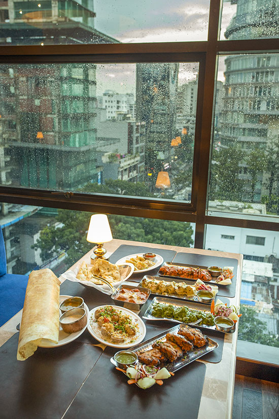
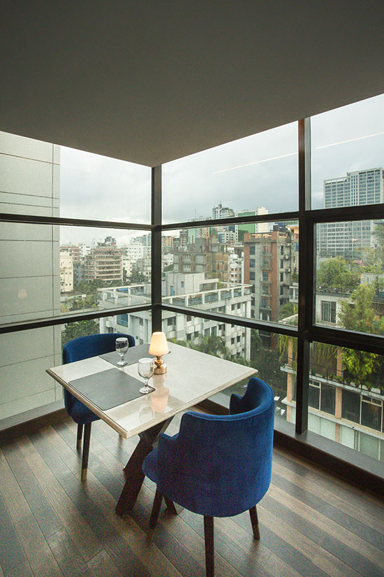
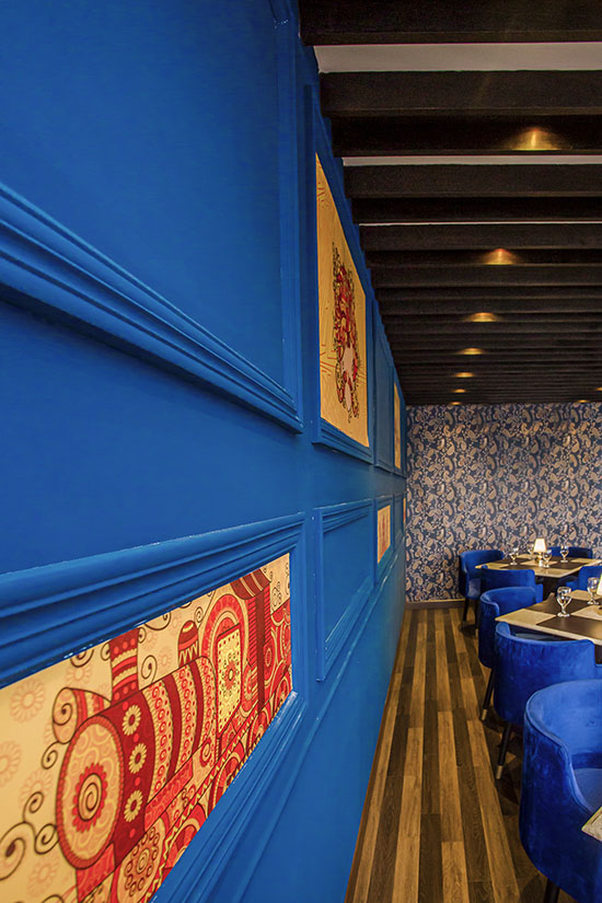
The design was executed in a contemporary style, preserving the Indian essence through pops of bright colours.
Undoubtedly, the star attraction of Tarka is its feature wall, being the only wall situated on the private corner of the place. Speaking of the highlighted wall, Raisa Chowdhury shares, “I feel, one eccentric corner or a highlighted piece in a monochromatic design is always nice as it helps to break the monotony. The chaotic Indian print on the wallpaper was the last touch we added, which added drama to the overall look.” The only challenge for the architect was the low height ceiling which was kept clean and basic to avoid any sort of attention. With its enticing decor and unbeatable food quality, it is safe to say that the new face of Tarka will satiate both your eyes and your stomach.
